Week 8 – Tell a Story!

Imagine you are being commissioned by a newspaper to tell a story in five to seven images. It can be about anything – ideally something local – but it must have a beginning, middle and end. It can be about a person, a place or a thing. Keep your focus narrow. What matters in this exercise is to make sure each photograph gets to the essence of what the narrative wants to express.

Share the five to seven images of your story below, and comment on the stories of your peers – tell them what you see. Did they understand what your story is about?

Week 7 – Artist Research

Franco Fontana

“The Purpose Of Art Is To Make The Visible Invisible”

Franco Fontana was born in 1933 in Modena. He took up photography in 1961 and joined an amateur club. He held his earliest solo shows in 1968 in Modena, his native city, which marked a turning point in his career. He has published over seventy books with Italian, French, German, Swiss, Spanish, American and Japanese publishers. His photographs have appeared worldwide in over 400 exhibitions, solo and collective.


The colour tones that Fontana achieves in these images flow so well as to remind me of brush strokes upon canvas. There is such a tonal range, the transition form one to the other doesn’t appear stark and harsh like that of a photograph can.  On brief inspection these could appear to be colour pallets but once your gaze settles upon them and you give yourself time to think about what your seeing, you start to read the hillsides and the horizons and pick out the details of what your actually viewing.  We see Fontana blur the lines between traditional landscape and abstract so closely with these, to be fair, I would happily see them in either category in an exhibit.

I love how Fontana achieves a series of images so simple that we look straight past them. That the majority of the developed world are going to see road markings on a daily basis but to take out the context on the road features such as pavements and cars, you can easily get lost in the colours, tones, patterns and textures within the images.  After all, Fontana is accenting what are the building blocks of photography, simplified.


Frances Seward

Frances Seward has a peculiar way of creating her unique landscapes and seascapes. With great passion, she has photographed the inner and amorphous world of solid glass by maneuvering it so that it performs like landscapes.

Thanks to the odd behavior of glass with its random nature of liquid and the static qualities of any other solid, Seward creates a myriad of textures just like any painter; however, instead of a paintbrush and palette, she uses her camera to capture the wonder of glass and natural light.


Maija Savolainen

A truly complex artist, Maija Savolainen is a recognized photographer from the Helsinki School. For this specific topic, we will focus on her project called paperworks in which she created abstract and minimalist representations of landscapes using a colorful palette. Much like watching a pastel ode to Hiroshi Sugimoto, Savolainen demonstrates through her work that the simplest resources can lead to the most beautiful simplifications and abstractions.

The series, Paperworks (See/Sea), is a study on the colors of sunlight and the photographic way of seeing. The images are made with a folded, white A4 sheet placed in direct sunlight at different times of the day and year. When looking at the picture at a distance, one might see a horizon line. When taking a closer look, it becomes clear that there is something strange about the view. The horizon appears to be a fold on a sheet of paper, the colors are reflections of sunlight on the white surface; a little bit of information makes the eye see something else than before.

Week 7 – Contact Sheets

BlackHole-ContactSheet-017aBlackHole-ContactSheet-020aBlackHole-ContactSheet-021

As discussed perviously, going tighter has really made a difference to the result considering what we finished up with in the first shoot.  Also adding the blue once more highlights the point of the whole project revolving around the blue marble.  Deviating from the blue with the marbles themselves at times works.  When the house lighting or window lighting gives a warmer colour cast but a deliberate colour change just does hold in my opinion.

With the marbles being hung on strings and then hun again and surrounded by the black hole, it was very easy for Joseph to move something in the room and create motion or when I repositioned myself between shots.  We then either had to wait for them to relax and settle on their own, or try to help them gently.  This did cause a lot of gaps in the shooting.

Before fitting the marbles through the black who we did just photograph them hanging against the black background which they were initially suspended on.  This has created some amazing bubbles due to the side lighting giving amazing halos and the centres appearing to loose their opacity.

Moving onto the rotating images, we couldn’t spin the subjects due to the reasons we discussed so we had to spin the camera instead.  Fortunately due to modern technology in cameras I could sink it with my phone.  This allowed me to place it on a rotating stand pointing up and still see the focus location.  Once the camera was spinning I could open the shutter from my phone and bulb setting for the rotation distance.

I have tried varying the position of the camera to get a centre point as seen in many of the images before altering to a side position which gave the varied circles, implying depth and distance.  Once these areas were explored, I moved on to varying the camera position and letting incentric circles form.

Due to some explore times being to short, we did end up with grey backgrounds but that is correctable should I need to move on with that image.

Week 7 – Shoot Plan

Looking back at what we achieved on the first shoot of this part of the project, we wanted to make something of what had been constructed which fitted more with what we had.  Jokingly, I suggested that ‘If your work isn’t good enough, your not getting close enough’, joking about Robert Capa’s quote but it did lead to the idea of getting rid of the excess and focusing on what mattered within the image.

Many of the previous images only allowed perspective and depth of field to be looked at along the horizon of an image, chasing where to focus in the image on the marbles but what if we could stack them with distance between to see how the alter at different depth and positions.  So we have created a stacking system, and just incase, we have looked at adding the rotation once more…

Week 5 – Evaluation


Since we had been working with rotation throughout it was time to focus purely on that. I feel we have achieved by coming out with such a diverse range of images.  Working on a glass table has given us an extra level of ability.  We have been swapping in and out the background colours to work for us but at the same time the glass allows us to light form bellow.

For the lit rotation though we had to find an alternative which came as simple as a kitchen bowl, with a bicycle light inside which projected up through the gaps in the paper and into the marbles, when present.

Joseph had already looked into creating triangles with the shapes and positions he chose when carving the card for the shade.  Initial we had to postpone this shoot due to the chosen card not being strong enough to hold the marbles on the kitchen bowl due to the weight.  We reinforcement it was an issue resolved.  What this did give was extra time to cut more card templates which were used without the marbles giving the white light rotations rather than the blue.

In some images extra marbles were added to break up the background and accent the rotating segments with their stationary presence.

Unfortunately in my mind, the white light is great on it’s own as a standalone set or stand alone images but the blue is missing from the previous modules selection.  There are plenty of beautiful blue images in the set but I feel I need to break this idea of constant blue so I can fit other colours or tones in to the final edit.  Maybe I need to go back to the beginning and rethink everything for the exhibition and book to give more variety.

Jelle Schuurmans

https://www.flickr.com/photos/jelle-s/with/16038434348/

Juls-CRT-IMG_0297.jpg

Chris Thompson

Gina in the smoke

Week 5 – Shoot Plan

Unfortunately on last weeks shoot, time got the better of us but we never got the rotation we wanted but we did get some great stationary images as discussed in the evaluation.  This week, we have sworn that we will be bringing back the rotation to take away what is completely visible and leave the viewer asking what they have seen within the images.

After the cardboard images didn’t leave us with anything like we had been hoping, it was time to look at straight lines again and how they would work well in a contrast to the spheres that are the base material for the project.

Bring to this the rotation, the straight lines, the spheres and free handheld lighting, I feel we have a strong base to work from.

Week 4 – Artist Research


https://www.lomography.com/magazine/333378-daguerre-s-diorama-and-its-legacy-to-contemporary-art-photography

The diorama was one of photography pioneer Louis Daguerre’s profound inventions, another one of his results from his obsession for recreating reality through staged events, stories, and habitats.

Hiroshi Sugimoto

https://www.sugimotohiroshi.com/new-page-54/

When I first arrived in New York in 1974, I visited many of the city’s tourist sites, one of which was the the American Museum of Natural History.  I made a curious discovery while looking at the exhibition of animal dioramas: the stuffed animals positioned before painted backdrops looked utterly fake, yet by taking a quick peek with one eye closed, all perspective vanished,and  suddenly they looked very real. I had found a way to see the world as a camera does. However fake the subject, once photographed, it’s as good as real – Hiroshi Sugimoto

Construction

Dreamcatcher
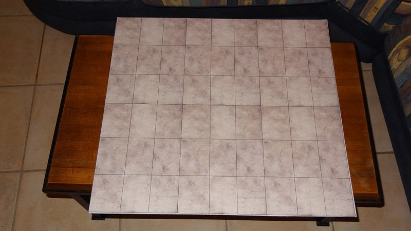
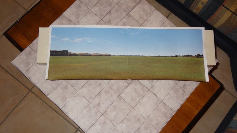
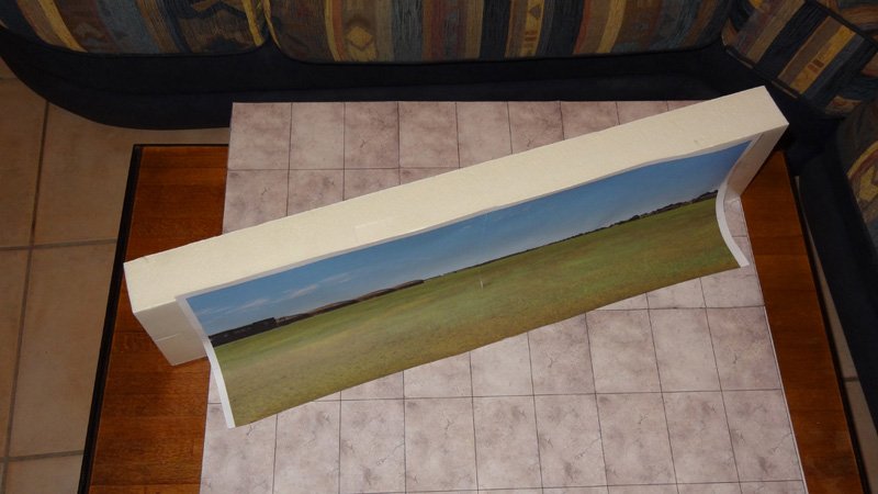
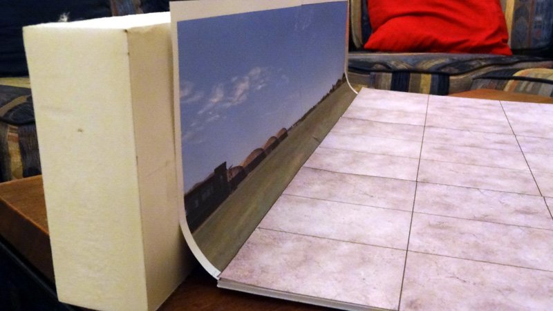
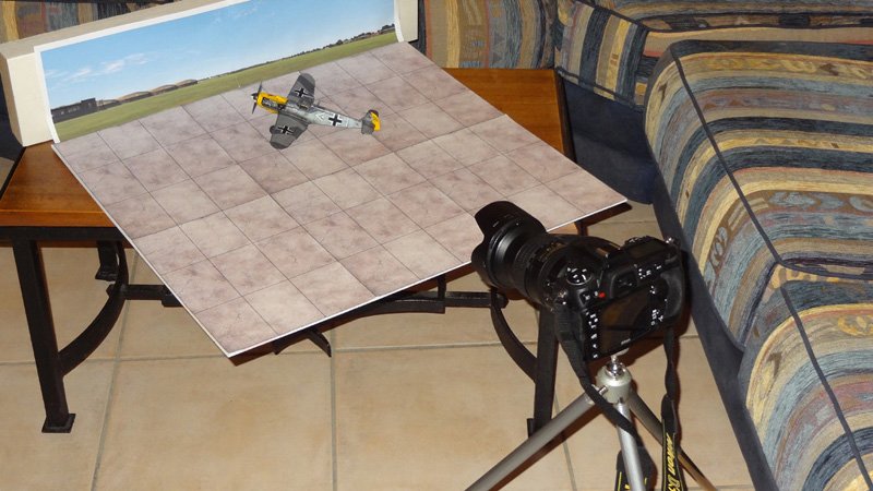
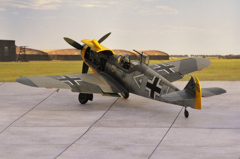
https://www.britmodeller.com/forums/index.php?/topic/234969852-tuto-photographing-your-models-on-a-diorama/

Week 4 – Evaluation


These came out a lot better than I expected.  This time we positioned the half sphere central and used all of the spare marbles, well almost, 6000 is quite a few.  Joseph became my portable lighting system as between us we tried different position to try and vary the images.

We tried from in front which did give us a strong set of images before moving to the side to try and increase contrast, above for the halo and behind to give that rim glow.  Each one brought something new to this before we added a second light, painting with light and no light to see how much further we could push the results.  It might seem that there wasn’t much going on in these images but due to working as a collaboration, there’s a lot of discussion between images, discussion over repositioning and then the discussion when sitting down to edit.

Trying to allow one to initial edit down, before the other then reduces more, leaves one to frame and the other to then suggest changes and edits. This work very well and at quite a speed with dual input.  We do try to sit and go through everything at the same time but this makes a 2 hour edit go from 20 final images to 7 for example.

From here I have then taken the images away for tidying in my own time.